Global Warming and Cyclonic Activity
An ArcGIS StoryMap on how ocean warming reshaped hurricane intensity and reach
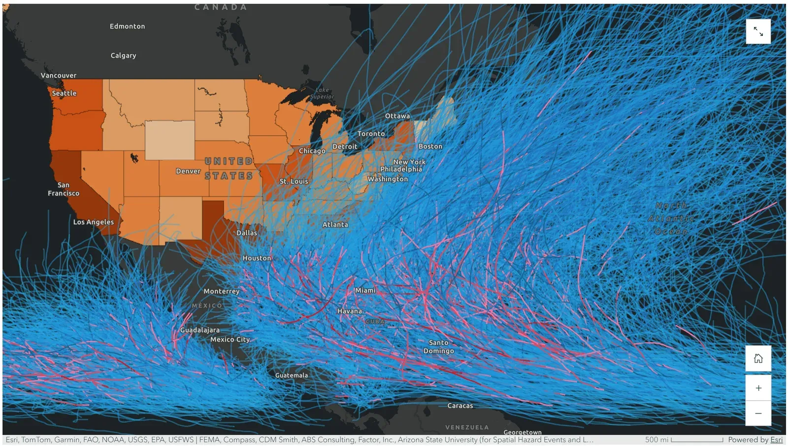
Mapping 150 years of hurricane tracks against sea-surface temperature showed storm counts staying roughly flat while high-intensity storms grew steadily more common, with the strongest storms clustering over the warmest water (80°F and above).
Result
Across roughly 150 years of hurricane data, the number of storms stayed about the same while the share of high-intensity storms climbed. Plotting tracks against sea-surface temperature made the link plain: the strongest hurricanes cluster over the warmest water (80°F and up), and storms in cooler water rarely reach top strength.
Objective
The goal was to test, with maps rather than text alone, how global warming has changed the intensity, count, and location of cyclones. I built the argument as an Esri ArcGIS StoryMap so each claim sits next to the map that supports it.
Approach
The StoryMap pulls from several sources and layers them. NOAA’s IBTrACS archive supplied historical hurricane tracks, which I split into 17-year phases from 1851 to 2020 to watch intensity change over time. A sea-surface-temperature basemap let me compare where storms form and strengthen against ocean heat. To carry the analysis into human impact, I overlaid FEMA national expected-loss data and U.S. Census American Community Survey low-income block groups against the track network. Every quantitative claim in the narrative is tied to a peer-reviewed source, including Chand et al. (2022) on declining overall frequency and work by Emanuel and others on warming-driven rainfall and wind.
Findings
The time series is the heart of it. The 1851-1868 phase shows tracks across the basin but very few high-intensity segments. The 2003-2020 phase shows a similar count of storms with far more red and pink (Category 4-5) track segments, which matches the literature: total frequency is roughly flat or regionally mixed, but the storms that do form trend stronger. The temperature comparison reinforces the mechanism, and the FEMA overlay shows the highest expected-loss areas are the same coasts hurricanes hit most.
Why it matters
The low-income overlay turns a climate trend into an equity problem. Poorer coastal communities sit directly under frequent storm paths and have the least capacity to rebuild, so the map doubles as a targeting tool for where hurricane-resistant infrastructure and aid would do the most good.